Visual Composer Page Builder (VC) is a wonderful help for developing WordPress page and post layouts visually and without typing code. It is a well-rounded product that I introduce all my clients to. But…
There are a couple of Visual Composer content blocks that need a little polish to make them visually appealing. The accordion block is one of them.
Use the CSS below to style VC accordions. Add the CSS to Dashboard > Settings > Visual Composer > Custom CSS.
These CSS rule sets style the default, active and hover states of the accordion header and the accordion content. The end result will look similar to screenshot under the code.
/**
* VC Accordion Header Text
*/

/* Default */
.wpb_accordion_section.group .wpb_accordion_header.ui-state-default {
  background: none;
  background-color: #f5f5f5;
  border: #ddd 1px solid;
  padding:0;
}

.wpb_accordion_section.group .wpb_accordion_header.ui-state-default a {
  padding:5px 0px 2px 15px;
  font-size: 18px;
  font-weight:bold;
  -webkit-font-smoothing: antialiased;
  line-height:32px;
}

.wpb_accordion_section.group .wpb_accordion_header.ui-state-default a:before {
  content: "\f347"; // We are using a Dashicon
  -webkit-font-smoothing: antialiased;
  font: normal 26px/1 'dashicons';
  vertical-align: top;
  line-height:30px;
  padding-right:10px;
}

/* Active */
.wpb_accordion_section.group .wpb_accordion_header.ui-state-default.ui-state-active {
  background: none;
  background-color: #45B0D0;
  color:#fff;
  border: 0;
}

.wpb_accordion_section.group .wpb_accordion_header.ui-state-default.ui-state-active a {
  color:#fff;
}

.wpb_accordion_section.group .wpb_accordion_header.ui-state-default.ui-state-active a:before {
  content: "\f343";
  -webkit-font-smoothing: antialiased;
  font: normal 26px/1 'dashicons';
  vertical-align: top;
  line-height:30px;
}

/* Hover */
.wpb_accordion_section.group .wpb_accordion_header.ui-state-default.ui-state-hover {
  background: none;
  background-color: #45B0D0;
  color:#fff;
}

.wpb_accordion_section.group .wpb_accordion_header.ui-state-default.ui-state-hover a {
  color:#fff;
}

/**
* VC Accordion Body Content
*/

/* Default*/
.wpb_accordion_section.group .wpb_accordion_content {
  background-color: #f5f5f5;
  border: #ddd 1px solid;
  border-top:0px;
}

/* Active */
.wpb_accordion_section.group .wpb_accordion_content.ui-accordion-content-active {
  background-color: #fff;
}

/* Hover */
.wpb_accordion_section.group .wpb_accordion_content.ui-accordion-content-hover {
  background-color: #333;
}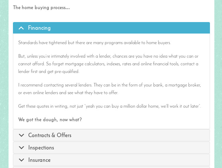
See the accordion live on GottaJavMiami.
Use Dashicons
The CSS rule sets above use Dashicons to create the expand and collapse icons to the left of the accordions. WordPress ships with Dashicons for use within the admin area. We can use Dashicons in the frontend too. Add the code below to your child theme’s functions.php file or to a functions plugin to enqueue WordPress Dashicons for use in your theme.
<?php

add_action( 'wp_enqueue_scripts', 'vr_frontend_dashicons' );
function vr_frontend_dashicons() {
   wp_enqueue_style( 'dashicons' );
}

?>
See a list of Dashicons in the WordPress resource documents.
Post links to your styled VC accordions. Feeling generous? Share the CSS too.
 wpDiscuz