“Ooh, look at that website with nice sleek and shiny page tabs. I bet it turns all the geeks heads. Why can’t I be like that guy?“
Recognize those thoughts? Of course you do. We all have feelings of inadequacy at times. Luckily for us regular guys, website sexiness can be learned. With a few easily digested and remembered tips you too will style websites that will make other webmasters sick with envy.
Back in October last year I showed you how to use CSS to highlight HTML elements when specific id and class names coincide on a page. For those who didn’t pay attention or who missed the lesson the original article is here and the example pages with all the required CSS and HTML displayed on them are here.
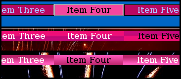
When I first wrote that guide I intended to follow it up with another one to show how to jazz-up those page tabs. I’ll be honest, I forgot to do it. Will you forgive me if I write that guide now? Please… Pretty please…. Whether you do or do not, I don’t really care because I know that deep down inside, somewhere close to the bottom of your soul you have already forgiven me; and here is that long awaited guide for those who want to know how to create glossy look navigation tabs. As with the previous guide, the HTML and CSS code for each page is printed on the page it effects. So now’s the time for you to switch on some music, relax and read as I show you how to turn this
into this
and this
It is advisable for you to look at the old example pages and the new example pages here and here just so you get an idea of where we are headed. The HTML and CSS for each page is included on each page it creates. Instructions to create true glossy tabs follow the simple “illusionary” method
Before we play around with the menu tabs, let’s jazz-up the pages and give them a little style 8-)
Most websites use one background style and image for every page. I think that’s a little bland. Granted, JournalXtra uses one style for nearly every page but JournalXtra is a WordPress blog and not a finely crafted piece of HTML art. If I wanted to use separate designs for each page of JournalXtra then I would create multiple templates but I’m too lazy to do that for my own blog.
To give each page it’s own distinct look we must give them each an identity. The best place to attach this identity is its <html> tag. For our demonstration pages, we will use
<html id="one">
<html id="two">
<html id="three">
<html id="four">
<html id="five">
<html id="six">
Next we add a CSS control for each <html> tag. The CSS for <html id=”one”> controls the HTML element of page number one and looks like this:
html#one
{
background-image: url(smoke-background-page-one.jpg);
background-position: top left;
background-repeat: no-repeat;
}
That CSS gives the page a nice non-repeated background image which is drawn from the utmost top-left of the page.
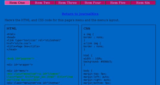
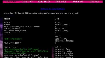
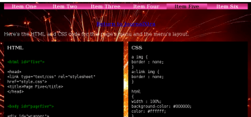
The <html> tag for each page with an ID is styled by similar CSS. It looks more complicated than it is. Once you begin to do it you will find it easy to do. Look at the HTML and CSS printed on the example pages to get an idea of how individual HTML tags are written and styled.
The CSS that is common to all <html> tags is written separately to the identified <html> styles, like this:
html
{
width : 100%;
background-color: #000000;
color: #ffffff;
}
Have a look at page number one to see all the HTML and CSS laid out side by side.
Now that’s out of the way, let’s sleek up the navigation bar with glossy tabs
In the original guide we learned to instruct browsers to display page tabs differently according to whether they are active, inactive or hovered over. We did that by specifying a CSS control for the coincidence of two classes, two ID’s or a class and an ID. For example, we can tell a browser to display a red tab for page one when page one is active and blue tabs for all the other pages because they are inactive; and a blue tab for page one when one of the other pages are active and page one is inactive.
The part of the original example page CSS that specifies the button style for the active page looks like this:
body#pageone a#itemone,
body#pagetwo a#itemtwo,
body#pagethree a#itemthree,
body#pagefour a#itemfour,
body#pagefive a#itemfive,
body#pagesix a#itemsix
{
background: red; /* active button's colour*/
color:#000000;
border: 2px ridge #CDD5DA;
}
That CSS instructs a web browser to display a red background for an <a> tag with a specific ID when it is displayed on a <body> tag with a specified ID e.g #pageone and #itemone OR #pagetwo and #itemtwo.
To sleek it up we must change the background setting from a color to an image and give the web browser four instructions:
- which image to display,
- to repeat that image horizontally,
- to not display a border, and
- to use a more suitable text color
In essence, the above CSS becomes:
body#pageone a#itemone,
body#pagetwo a#itemtwo,
body#pagethree a#itemthree,
body#pagefour a#itemfour,
body#pagefive a#itemfive,
body#pagesix a#itemsix
{
background-color: black;
background-image: url(active-glossy-tab.jpg);
repeat: repeat-x;
color: white;
}
Similar edits must also be made to the other elements of the menu that control the design of the inactive button and the hovered over button. Those elements are
a.ment
and
a:hover.ment
We change them to give a more suitable text color, background color, background image and to remove any borders.
Once the border is removed, the menu buttons must be enlarged horizontally by a pixel or two to compensate for the space that was previously taken by it. Without this compensation, the menu will appear slightly shrunken relative to the rest of the page.
To calculate the proper size for each menu item simply divide the width of the menu’s encasing div by the number of tabs within it (in this case 840 pixels divided by 6 menu items). In this the menu case has the ID of #menucase and the width of the button is specified in a.ment
Creating the Buttons
The illusionary method
The easiest way to create a glossy look navbar is to create active, inactive and hover-over buttons with two-tone color graphics (a graphic with one color at it’s top half and another color at its bottom half). Be aware that this method is only a trick of the eye and works for small tabs only.

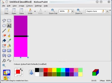
To make two tone graphics we use a simple graphics program like Paint (Windows) or Kolourpaint (Linux). The full instructions are:
- create a canvas 10 pixels wide and 31 pixels high,
- zoom in %800,
- draw a pixel wide line horizontally across the middle of the canvass (15 pixels from the top or 15 pixels from the bottom),
- fill the bottom half of the canvass with one color,
- fill the top half of the canvass with a lighter or darker tone of the color used for the bottom half of the canvass,
- fill the dividing line with either of the colors above or below it.
- resize the canvass so that it is 1 pixel wide and only as high as required for the buttons,
- repeat the process until you have a button background for the buttons’ active, inactive and hover states (you should have 3 graphics in total).
Color is the key consideration here, for greatest effect the top and bottom colors shouldn’t be too dissimilar and should not be too dark. The color of the page and the button text also contribute to the effect. Light text colors work best because they impress glint.
For example page one’s CSS, the active button is specified in body#pageone a#itemone the inactive button is specified in a.ment and the hover button is specified in a:hover.ment. a:active.ment is only used to specify the text color of the active tab.
The non-illusionary method
Any image such as a picture, texture or gradient may be used as the background of a button or other HTML element. Were I to really style up those menu buttons I would create a truly glossy graphic with GIMP or Photoshop (I prefer GIMP). To give you the general idea, here is the same menu with buttons created with a gradient (gradient buttons):

Those buttons were created with GIMP. The method is simple (click the below image to learn the location of the used tools):
- Create a canvass of 20 pixels by 60 pixels,
- Select the gradient tool,
- Choose a foreground color,
- Choose a background color,
- Stretch the gradient over the canvass,
- Save it as the active button graphic,
- Reverse the gradient tools direction,
- Repaint the gradient,
- Save it as the inactive button graphic,
- Create another one for the hover button graphic if required.

It really is that easy. The hard part is creating the menu with CSS and HTML and getting the buttons to highlight when selected. But you have nothing to worry about as the CSS and HTML is printed on the example pages ;-)
If you really want to thank me for this guide then please backlink to JournalXtra from your directory or somewhere else.
To what else can we apply this CSS control method
We can use the same principle to affect any HTML tag. For example we can tell a web browser to display a different background image for various <div> boxes whenever a specific page loads. To do that we would assign an ID to the <html> tag of each page and specify a CSS control for the coincidence of an <html> tag with a specific ID and a <div> tag with a specific ID. For example:
html#one div#boxone
{
background-image: url(I-am-a-special-box.jpg);
background-position: top left;
background-repeat: no-repeat;
}
The above CSS would tell a browser to load div#boxone and fill it with the background image “I-am-a-special-box.jpg” whenever the page <html> tag has the ID of “one” (i.e <html id=”one”> ).
It is an amazingly simple CSS control principle to implement that is rarely used beyond navigation bar tabs. It’s a shame because the web would be a much more aesthetically pleasant place were it more frequently applied to other page elements.