My imagination has been racing with ideas about how great Ubuntu 11.04 will be when finally released. Unable to contain my enthusiasm any longer I decided to download Ubuntu 11.04 Beta 1 and give it a whirl on my newly built AMD quad core PC. I am absolutely flabbergasted at how shit the new Natty distro is. I can see “natty” becoming a byword for “trash” and when it does “Natty by name, natty by nature.” will be this distro’s maxim.
A long time user and proponent of Ubuntu and all things Linux and open source, I am well placed to say to anyone who intends to install Natty, “Stop! Curb your enthusiasm. Wait for the final release or skip it altogether.”

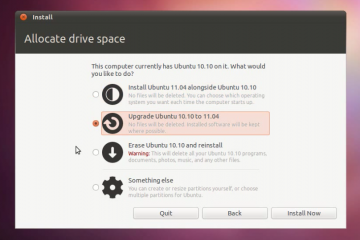
Natty looks good. The installer is easy to follow and gives several installation options. It installs quickly enough. Took around five minutes on my new computer and I had a working OS after restarting the machine. All told, it took about 6 minutes to install and boot to a working desktop.
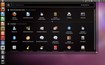
I was excited when I saw the new Natty desktop load. It heralded new opportunities to explore a new world of Linux adventure. A little wary of the task management panel at the left side of the screen because it reminded me of the bad ol’ MS Office Quick Launch bar from my Windows days, but, I thought, I will just remove it and replace it with quick launch buttons in the panel at the top of the screen.
My wariness was not premature. Little did I know that Natty uses Canonical’s Unity desktop environment shell and that the task management panel is integral of it. Even less did I know that the menu panel at the top of the screen would behave nothing like it does in previous Ubuntu versions. Even worse, new panels could not be added to my desktop to make it behave and look the way I want it to behave and look.
The Unity environment is designed for netbooks and other small screened mobile devices so the developers purposefully saved screen space by,
- using one permanent menu panel at the top of the screen,
- removing individual window menus from the tops of all open windows, and
- making the application panel invisible until the mouse cursor is hovered over the Ubuntu logo image in the menu panel.
Those space saving changes are fantastic and welcome if you use a small screen. But why has Canonical forced them onto everybody else?
Unfortunately there is no task bar and none of the menus that users of previous Ubuntu versions are accustomed to using.
The Applications, Places and System menus that once displayed in the panel at the top of the screen have been removed. I would like to say they have been moved to the task management panel but that isn’t quite true. Some of their menu items have been moved to the management panel. The rest of them have vanished and I’ve yet to find them. Actually, I’m not going to waste the effort finding them, I’m just going to install KDE via Kubuntu. If you haven’t guessed, I’m writing this review of Natty while testing it for the first time.
The menu panel doesn’t even allow quicklaunch buttons (or anything else) to be added to it by end-users. If you dare install it, try right-clicking the panel or anywhere on the desktop and you will see what I mean.
In Unity, window menus are displayed in the menu panel at the top of the screen for whichever window is currently active. My feelings are ambiguous toward this. It does save a little bit of space and makes the windows aesthetically cleaner. But, I have a 19 inch widescreen monitor and I don’t always maximize windows. There is a lot of hand action required to move the mouse cursor from the middle of the screen to the top of the screen just so I can access a menu. Window titles display as expected for non maximized windows. I could happily live with the new menu panel if I could right click a window’s title to access its menu. Sadly, that is not an option.
But my real hatred for Unity is spurred by the complete lack of a taskbar. To find a non active application’s window is a chore that requires Alt+Tab to be pressed to cycle between them otherwise the cursor must be moved to the top right of the screen to activate the task management panel and then the cursor must be moved down the task management panel to locate the icon for the window one wishes to activate. It’s harder than it sounds. There is little distinction in the panel between active windows and application launchers. Plus, it takes as long to do as it has just taken you to read this paragraph.
Overall, Natty seems a little slower to boot than Ubuntu 10.10 and applications take a little longer to launch. Applications are awkward to find in the new task management menu. Swapping between active and inactive windows is a chore. The removal of individual window menus in favor of a menu panel at the screen top increases the time taken to use menu items… Altogether, these few gripes make Natty an Ubuntu release worth skipping.
Remember that this scathing review is of Ubuntu 11.04 Beta 1. Perhaps Natty’s final release will be a major improvement. Although I doubt it will improve given the reviews I have read about Unity’s development team not paying attention to user feedback. For example, this quote from a Wikipedia article about Unity:
In March 2011 writer Benjamin Humphrey criticized the development version Unity then being tested for Ubuntu 11.04 on a number of grounds, included a development process that is divorced from user experiences, the lack of response to user feedback, “the seemingly unbelievable lack of communication the design team has” and a user interface which he termed “has become cluttered and inconsistent”. He noted that “design decisions for Unity are seldom made in public, and they’re only announced after due effort, time and money have gone into implementing them. When there is a backlash, decisions are rarely overturned.” He also cited lack of usability in right-to-left languages, lack of differentiation between applications and preferences, inability to query the Unity version number and the use of preferences for logging out and shutting down. He found the launcher hide behavior “counter-intuitive” along with moving items on the launcher, as some are movable and some are not and it is not clear which are or why and the use of “invisible application menus”. He concluded “let me stress: Unity is not all bad…While a number of the concepts in Unity may be flawed from a design point of view, the actual idea itself is not, and Canonical deserve applause for trying to jump start the stagnant open source desktop with Unity when the alternatives do not evoke confidence.”
It’s not all bad. On the plus side, my hardware was detected and installed properly.
You can read more about Ubuntu 11.04 and unity at either of these locations:
Update:
9 hours later, after installing the Kubuntu Desktop Environment alongside Ubuntu along with many updates, upgrades and software packages, I have discovered I can have a taskbar at the bottom of my Ubuntu 11.04 desktop. To get Natty Ubuntu looking somewhat similar to Maverick you must change your desktop environment to “Ubuntu Classic” when you log in by clicking your username then changing “Ubuntu” (in the dropdown box) at the bottom of the screen to “Ubuntu Classic”. I would never have realized this had I not installed KDE (Kubuntu).
