Big ugly table borders only work for people with fetishes about big ugly table borders. Of the fetishes I have, that is one I am glad to report I lack. I enjoy looking at thinly lined tables that are as neatly displayed as those one might draw on paper. You might not believe that while looking at some of the tables used in JournalXtra in the past, but I hope to show you the light I have seen.
It took me a while to realize a simple way to change the appearance of HTML tables to make the borders pencil thin.
I knew I could set styling properties in the CSS to change the border width, to turn borders off, to turn only some borders off, to make borders ridged, grooved, dotted or dashed but I couldn’t figure out how to get rid of the ugly double-bordering created by the gap between different borders.
Then I had a brainwave: why not just get rid of the borders?
That might seem contradictory. After all, I want the borders to look nice, I don’t want to make tables hard to read by not having any borders altogether, so why would I get rid of them?
Let’s take a look at my reasoning
A basic HTML table consists of 3 HTML tags as shown in this table.
| Tag | Purpose |
| <table> | Marks out a table’s placement |
| <tr> | Marks a row of table data |
| <td> | Marks a cell of table data |
Written in an HTML page with their corresponding closing tags, they would look like this:
<table>
<tr><td>some data</td></tr>
</table>
The <table> and <td> tags have their own margin, border and padding properties. Each may also be given its own text color, background color and background image.
Even with border properties set to “none”, those borders still have a little spacing between them. When a border width greater than zero is specified, that spacing creates those ugly double borders.
Double-border fetishists beware: those double borders are about to vanish!
We can use two little known border properties to vanquish border spacing:
- border-collapse: collapse;
- border-spacing: LENGTH;
Border collapse can take one of two values: separate or collapse. The default value is “collapse”.
Border-spacing is specified in pixels and is naturally set higher than zero.
Both border-collapse and border-spacing are used with the CSS table selector, as shown in the examples given below here.
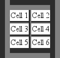
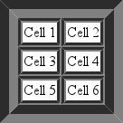
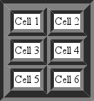
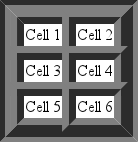
Take a look at the four example table images shown below:
- table one has a 2 pixel border set for both the <table> and <td> tags
- table two has a 2 pixel border set for both the <table> and <td> tags but border-collapse set to “collapse”
- table three has a 2 pixel border set for both the <table> and <td> tags but border-spacing set to zero
- table four has no borders set but has border-spacing set to 2 pixels and contrasting background colors stated for both the <table> and <td> tags
The CSS used for each of those tables was:
table.one{border: 2px solid black;}
td.one{border: 2px solid black;}

table.two{border: 2px solid black;border-collapse:collapse;}
td.two{border: 2px solid black;}

table.three{border: 2px solid black;border-spacing: 0px}
td.three{border: 2px solid black;}

table.four{background-color:black;border-spacing:2px;}
td.four{background-color:white}
The HTML markup used in each case (with relevant ID’s and classes specified) was:
<html>
<head>
<link rel="stylesheet" type="text/css" href="example.css" />
</head>
<body>
<table>
<tr><td>Cell 1</td><td>Cell 2</td></tr>
<tr><td>Cell 3</td><td>Cell 4</td></tr>
<tr><td>Cell 5</td><td>Cell 6</td></tr>
</table>
</body>
</html>
Looking at those example tables:
- table one has the ugly double bordering that I generally hate to see
- tables two and four have well defined, thinly drawn borders without spacing gaps between them
- table three has a well defined border surrounding its cells that is apparently twice as thick as the border described in tables two and four.
Consider table one and its method of creation binned.
Tables two and four look the same. They each have a 2 pixel border running around their cells and surrounds; and they each have the same width and height. The only difference is that table two has its border properties explicitly stated in its CSS whereas table four has no borders specified. Take a look at their CSS if you don’t believe me.
Table two uses the collapsed-borders property. Unfortunately, the collapsed-borders property has one slight complication. In fact, it’s a huge complication that makes double-bordering appear pretty pleasant in comparison: collapsed borders crumble to a mess when a table and its internal cells both have styled borders.
To prove that, look at the next two tables, tables five and six. Both tables have a 20 pixel grooved table border and a 5px grooved data cell border defined but table five has collapsed borders and table six has zero border spacing.
| Collapsed Grooved Borders | Non Collapsed Grooved Borders with Zero Spacing |
 |  |
| Table Five | Table Six |
It is hard to believe that table five is supposed to look like table six. It is another example of why I dislike and discourage the use of the CSS “border-collapse: collapse;” property value.
Table six is similar to example table three. The exception is that its borders are thicker and grooved. It illustrates the benefit of specifying a value for border-spacing for your table’s CSS.
There is a downside to defining both <table> and <td> tag borders even when border-spacing is configured to zero pixels: the table can appear a little unbalanced when the <td> tag’s borders have a different width to the <table> tag’s borders. Try it for yourself to see what I mean.
Is it possible to style a border without specifically defining a table border?
Definitely!
There is another little used CSS property that creates a bit of a ghost image:
- outline: COLOR STYLE WIDTH
The outline property draws a styled or unstyled shadow around the object it is defined to affect.
Outline has a few behavioral properties that are worth noting:
- outlines do not increase the pixel size of an object
- outlines take up no extra screen space
- outlines overlap other items
- most recently drawn outlines overlap outlines drawn prior to them
- the outline rendered last will cover any outline rendered earlier than it
A couple of those notes are reiterations of each other but I thought they needed drilling in to clear up any ambiguity. Just to make sure you get it… if two objects are drawn next to each other, one stacked on top of the other, the lower edge of the top object will be covered by the upper edge outline of the bottom object. The top object will not be displaced by the outline of the bottom object. Think of an outline as being an object’s shadow – it may be cast over other objects without disturbing them.
We can draw a styled “border” for a table’s cells without specifying a border width by setting the table’s <td> tag’s outline to a width equal to the table’s border-spacing’s width; if we want a defined outline for the <table> tag that does not overlap items placed next to it then we can specify a margin for the <table> tag that is equal to the outline defined for it. The results, as can be expected, are slightly different to those for tables with styled, non-spaced borders.
Consider the next two tables, table seven and table eight. Table seven uses styled borders whereas table eight uses styled outlines to shape its borders.
| Defined Border with No Border Spacing | Defined Outline with Border Spacing |
 |  |
| Table Seven | Table Eight |
Notice the absence of the double bordering in table eight. The outlines surrounding its data cells have overlapped and canceled out the doubled appearance.
The outline width of table eight’s <td> tags had to be increased slightly to make its dimensions (near) equal to table seven’s dimensions.
The CSS for those two tables is:
table.seven {border: 10px gray groove; border-spacing: 0px;}
td.seven {border: 10px gray ridge;}

table.eight {outline: 10px gray groove; border-spacing: 14px; margin: 10px;}
td.eight {outline: 14px gray ridge;}
The 10 pixel margin used in table eight is equal to its <table> tag’s outline width and serves to prevent the outline from overlapping other page elements. Used in a real page layout, that margin would be set only on the sides that touch other page elements.
The tables used in WordPress posts may be easily styled with the help of the header-footer plugin. Visit the plugin’s settings and add this code into the second text area which has the annotation “HTML code to be inserted in the head section of each page”:
<style>
#content .entry table {border: 1px solid gray;border-spacing: 0px;}
#content .entry td {border: 1px solid gray;}
#content .entry th {border: 1px solid gray;}
#content .entry caption {border-bottom: 1px solid gray;}
</style>
That will define a single line border.
If you prefer not to use explicitly defined borders as per the CSS, try something similar to this:
<style>
#content .entry table {background-color: gray;border-spacing: 1px;}
#content .entry td {background-color: white;}
#content .entry th {background-color: white;}
#content .entry caption {background-color: white;}
</style>
you can even center them by adding “margin-left: auto;” and “margin-right: auto;” to #content .entry table {}.
This will work for most WordPress themes.
Sometimes, it is preferential to have double-borders, especially when table borders are styled. My personal preference is to use a neatly drawn single width line around the table and between its cells without any spacing between the borders.
As shown above, there are three nice ways to create tables with borders that do not have an ugly gully space between them:
- Method One
- define a background color for the <table> tag
- define a contrasting background color for the <td> tag
- control the border width with the CSS table selector’s border-spacing property
- Method Two
- define a <table> tag border
- define a <td> tag border
- set both borders to an equal width
- set the border-spacing to zero
- Method Three
- define the table as per method one
- use the outline property to define <table> and <td> border styles
- set a margin for the <table> tag for the sides that touch other page elements
- set the border-spacing width equal to the <td> tag’s outline’s width
Method two can result in double-borders when the borders are styled. Method three is a styled version of any table created via method one.
| Property | Values | Description |
| border | width, style and color | Permits the width, style and color to be specified on one line |
| border-width | none, pixel specification or thin, medium, thick or inherit | Controls the property’s width |
| border-style | none, hidden, dotted, dashed, solid, double, ridge, groove, instep, outstep, inherit | Controls the way borders are drawn. |
| border-color | Color name, hexadecimal or RGB value. | Controls the property’s color to be specified |
| border-collapse | collapse, separate | Specifies whether a table’s border should be collapsed. |
| border-spacing | LENGTH | Defines the distance between table and cell borders |
| background | width, style and color | Permits the width, style and color to be specified on one line |
| background-color | See border color | See border color |
| background-image | url(http://domain.tld’) | Permits an image to be specified for display as an element’s background. |
| outline | width, style and color | Permits the width, style and color to be specified on one line. Can be applied to any element. |
| outline-width | See border width | See border width |
| outline-style | See border style | See border style |
| outline-color | See border color | See border color |
Border, border-color, border-width and border-style can be suffixed with -top, -right, -bottom or -left to determine which side of the specified property is configured by the values set.
More information about tables and their styling properties is available from
As with most things aesthetic, beauty is in the eye of the beholder. However you style your tables, my opinion is that it is often neater to specify separate background colors for <table> and <td> tags instead of using border-collapse to remove double bordering within tables.
How do you like to style your tables? Leave a comment and let us know.


