JournalXtra has a brand new coat. We wanted something clean, simple and clear; a look we knew you would love and that would make visiting JX a pleasure for desktop drivers and mobile riders. We hatched a plan, took out our paintbrushes, rollers and stencils then pulled down the old and built up the new.
Little says distraction free and speaks with elegance quite like black and white with a dash of color to add depth.
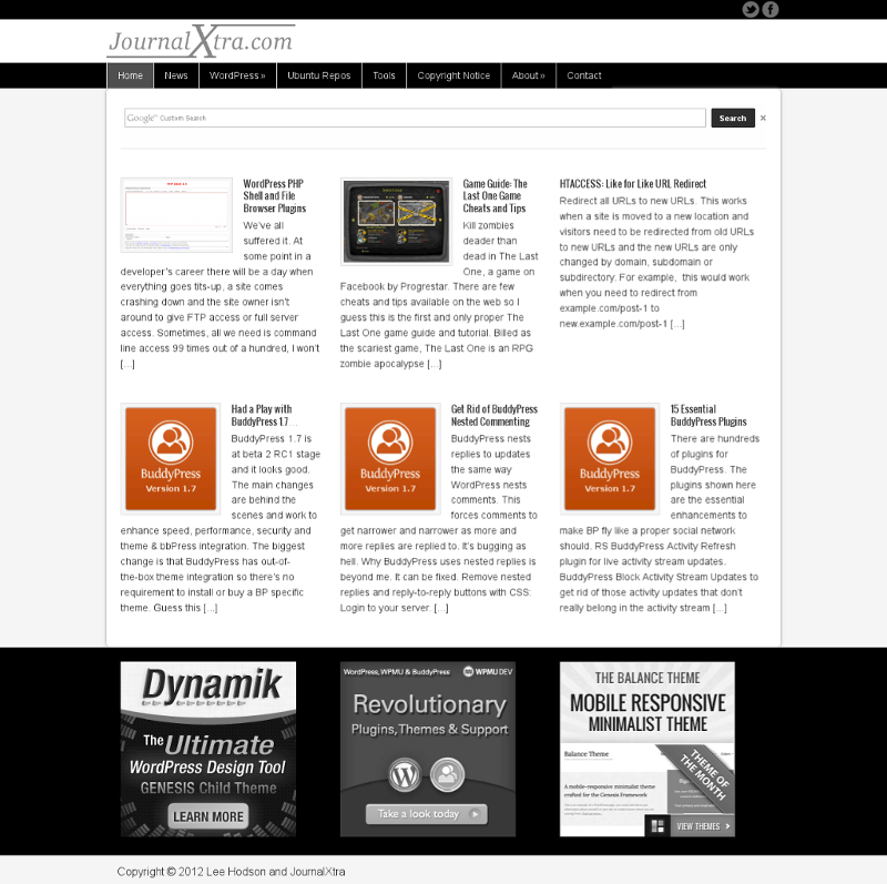
This time around we built a magazine style homepage that shows off our most recent posts in a quick-to-view grid.
We chose a page and post layout that made the table of content easier to see. The new post layout has two sidebars. The left bar is for page and site navigation and the right bar is for us to showcase ads and other items we think important.
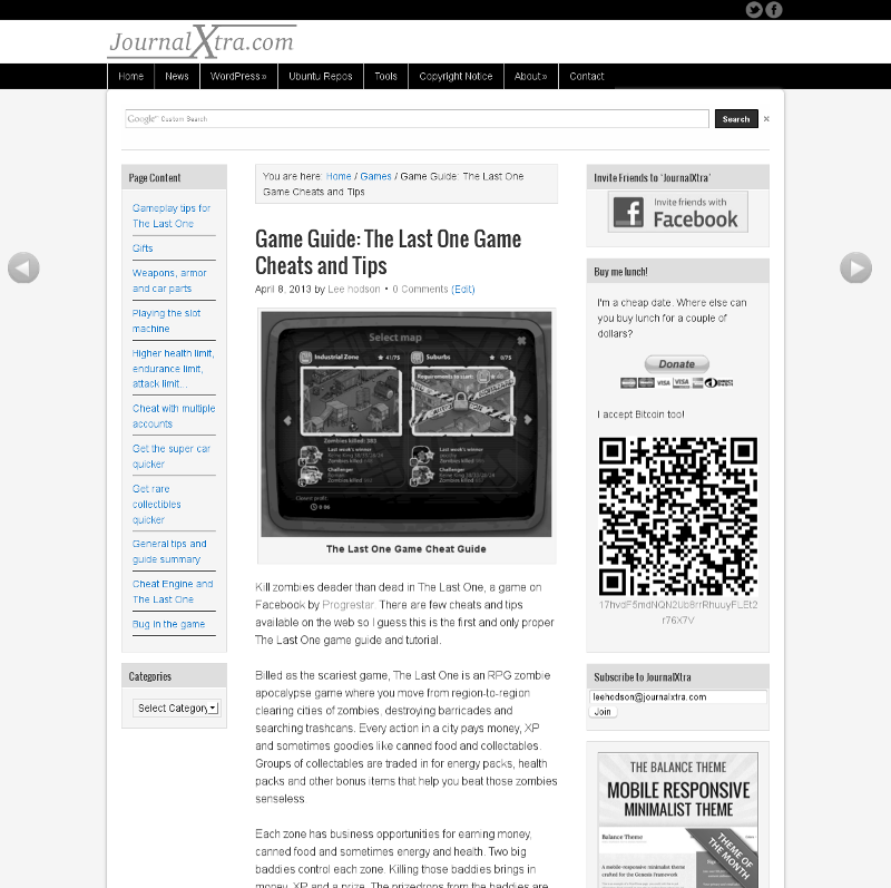
Look carefully and you’ll notice the left and right navigation arrows. Use these to flick through posts as though the site is a book.
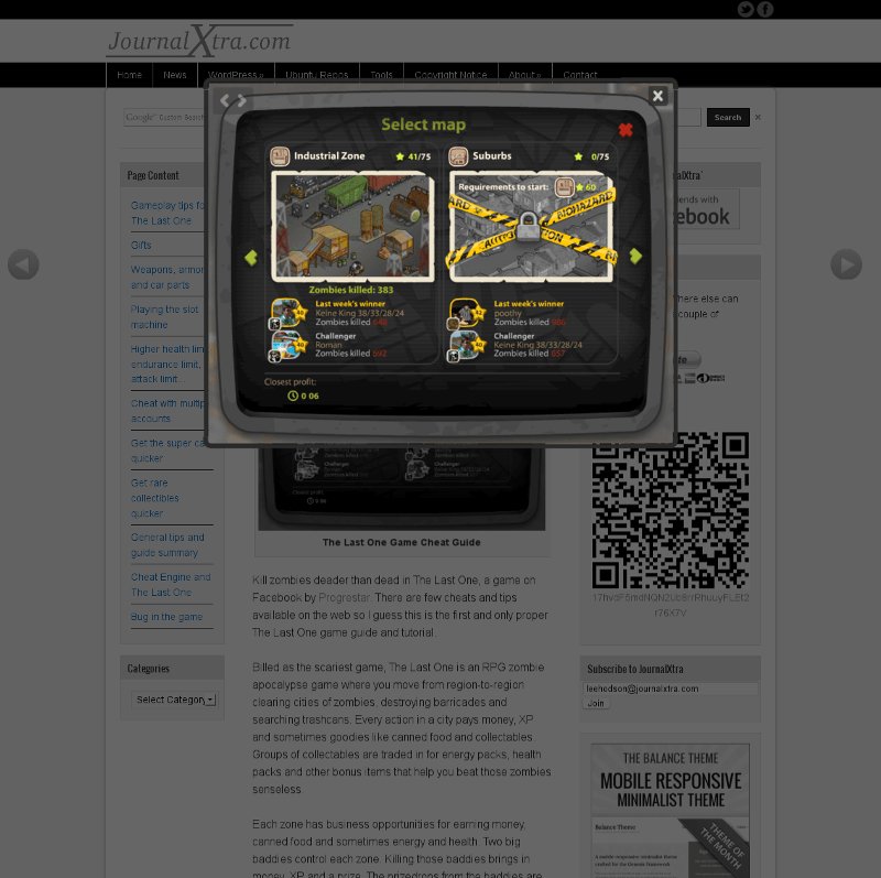
All but links, homepage images, download buttons and gallery image pop-ups are in black and white. Click any image in a post to open a full color popup of it.
Our new theme, nicknamed Grayscale is built with Dynamik on top of the Genesis framework. We hope you love it as much as we do.
