How to Change the Shape of Genesis Menu Tabs
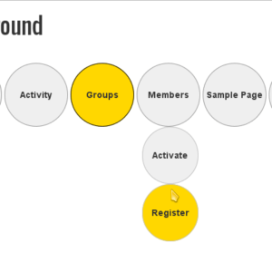
Most WordPress nav menus are shaped as square or rectangular blocks. Some menus use color gradients to add depth to those blocky shapes. How can we change those menu tabs into diamonds, circles or other shapes? We can use background images to give the illusion of different shapes, or, We can use CSS3 to skew, … Read more